外观
栅格布局
使用flex布局的痛点:
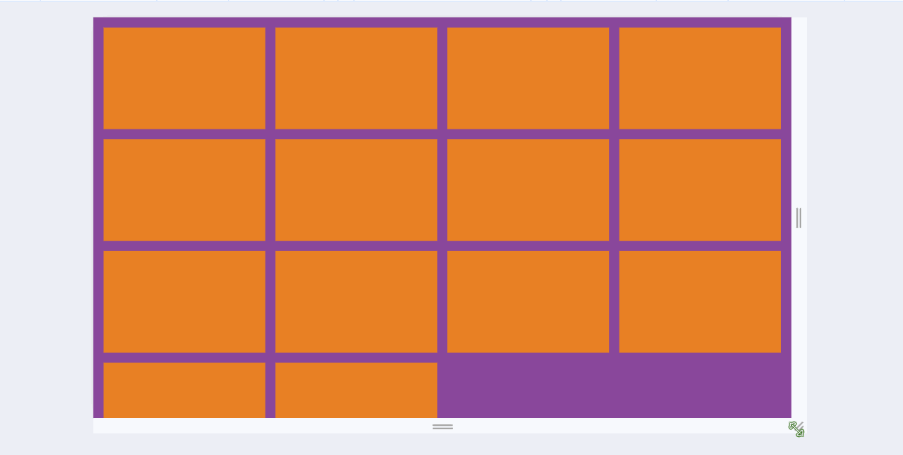
如果使用justify-content: space-between;让子元素两端对齐, 自动分配中间间距, 假设一行4个, 如果每一行都是4的倍数那没任何问题, 但如果最后一行是2, 3个的时候就会出现下面的状况:
如果想让最后一行左对齐也是有办法的, 能实现但是操作起来有些麻烦, 但是如果这种布局使用grid布局的话, 就会变的非常容易.
display: grid: 是转为栅格布局, 这个是必须的.
grid-template-columns: repeat(5, 1fr): 将网格分为几列, repeat是重复, 循环, 1fr是自适配单位.
gap: 20px: 栅格项之间的间隔.
看, 上面的grid布局, 最后一行不是5的倍数, 但是可以左对齐, 不会有像flex布局一样的特性.
grid-template-columns 属性
grid-template-columns: 1fr;: 独占一行.

grid-template-columns: 1fr 1fr;: 一行分为两列.

grid-template-columns: 1fr 200px 1fr;: 中间固定200px, 两边自动平均分配.

grid-template-columns: 1fr 1fr 1fr 1fr 1fr;: 如果多列的值相同, 可以使用repeat()函数.
grid-template-columns: repeat(5,1fr)当然将1fr缓存固定的px尺寸也可以.

grid-template-columns: repeat(auto-fill, minmax(255px, 1fr));: 这种写法可以用来做响应式布局, auto-fill主轴上指定的宽度或者重复次数是最大可能的正整数, minmax最小值255px, minmax最大值1fr代表剩余空间的比例.
注意
要实现这种响应式布局, 父容器不能使用固定宽度, 可以将父容器改为如:80%, 这样就能根据屏幕的宽度, 自动展示一行展示几个了.
grid-row和grid-column属性
可以控制某个元素占领几份.
以grid-row行为例, 从第几列开始 / 第几列+想占几个.
grid-row: 1/3;
grid-column: 1/3;
版权所有
版权归属:Erhai-lake